Illustrative Tattoos: What the Style Is and Where It Comes From
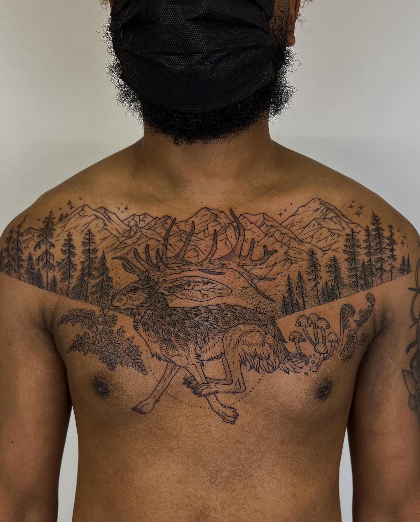
Why two “illustrative” artists can make very different tattoos, how to search for the sub-style you want, and why fine hatching needs a bigger tattoo.
Related galleries
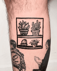
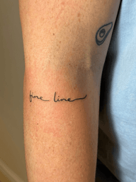
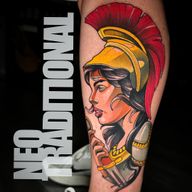
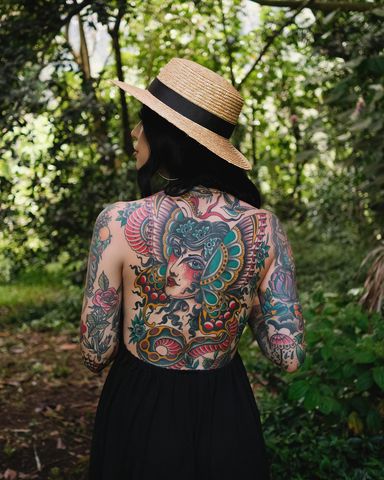
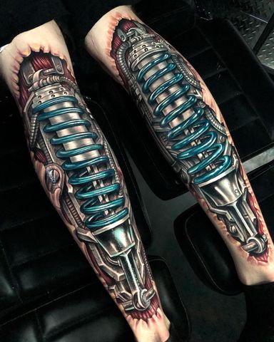
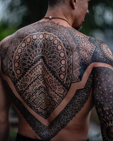
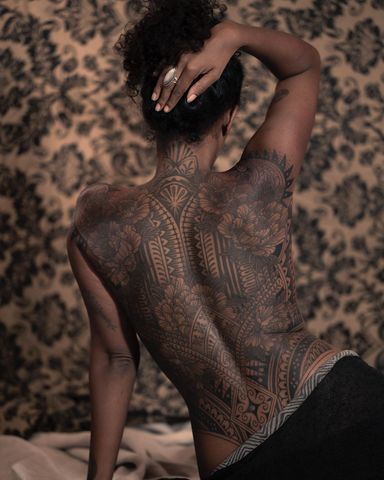
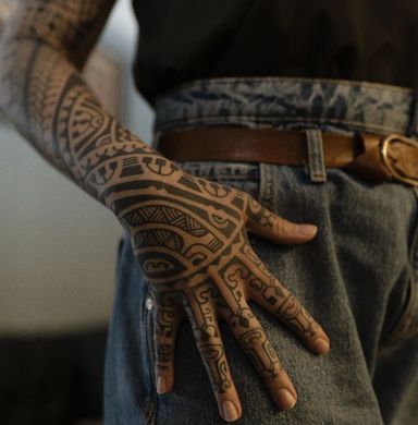
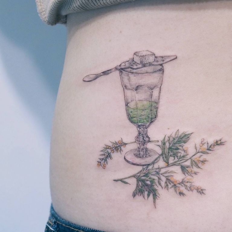
Illustrative tattoos look drawn or printed rather than photographed. The linework stays visible. Shading comes from hatching, dots or loose washes instead of smooth gradients. The term is a broad umbrella that covers etching, sketch, fine linework, comic and painterly work. It sits between traditional, with its bold outlines and set palette, and realism, which hides the line.
Summary
- If you can see how the image was drawn, most artists will call it illustrative.
- Bold outlines with open space age best, and tight hatching blurs first.
- Search and book by sub-style, since “illustrative” alone covers very different artists.
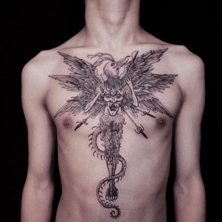
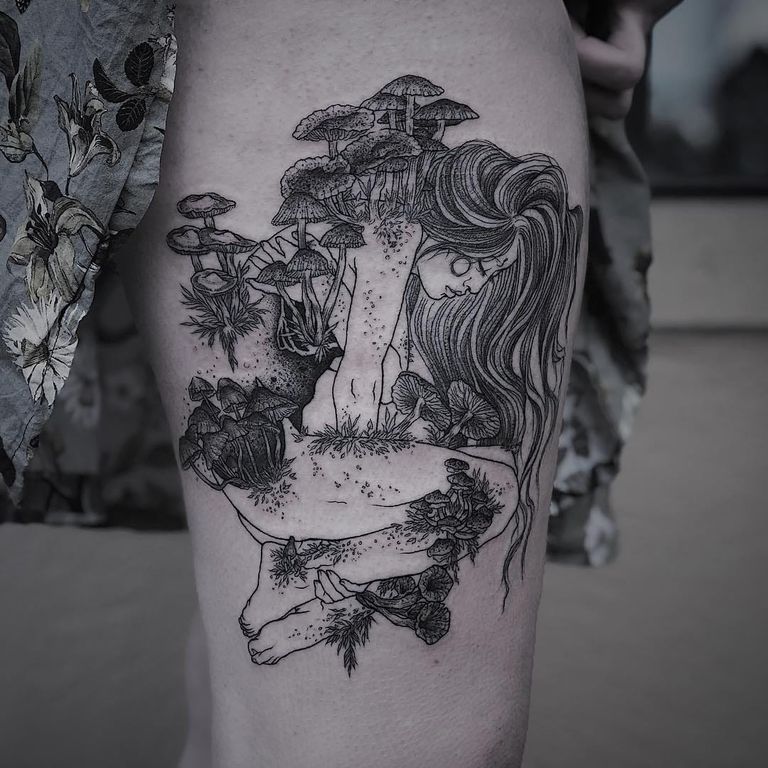
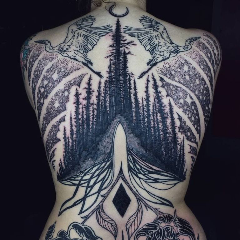
What makes a tattoo illustrative
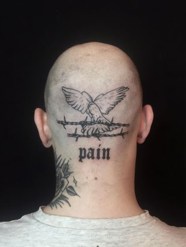
The test most tattooers use is simple. Does it look like a drawing or a print? An illustrative tattoo keeps the marks that made it. Outlines can be thick or thin, clean or sketchy. Tone is built from line: hatching, cross-hatching, dots, or a wash of color inside a drawn edge.
Nothing else is fixed. The work can be black or full color, palm-sized or a whole back. The subject can be anything. That’s why two artists who both call themselves illustrative can make very different tattoos.
Types of illustrative tattoos
Most portfolios lean toward one or two of these. Knowing the names makes it easier to search for the look you want.
Etching and engraving
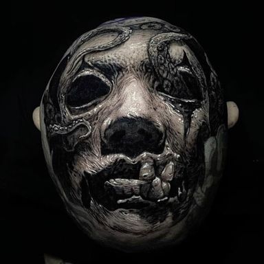
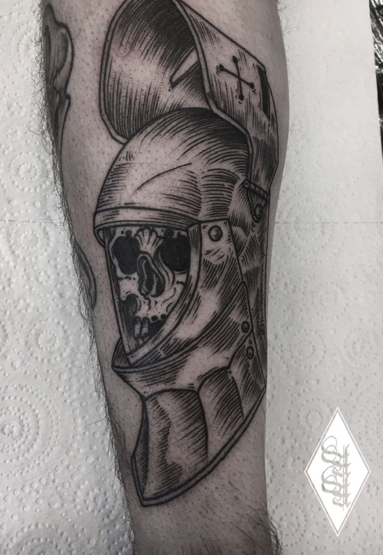
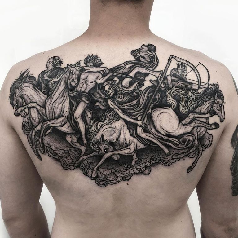
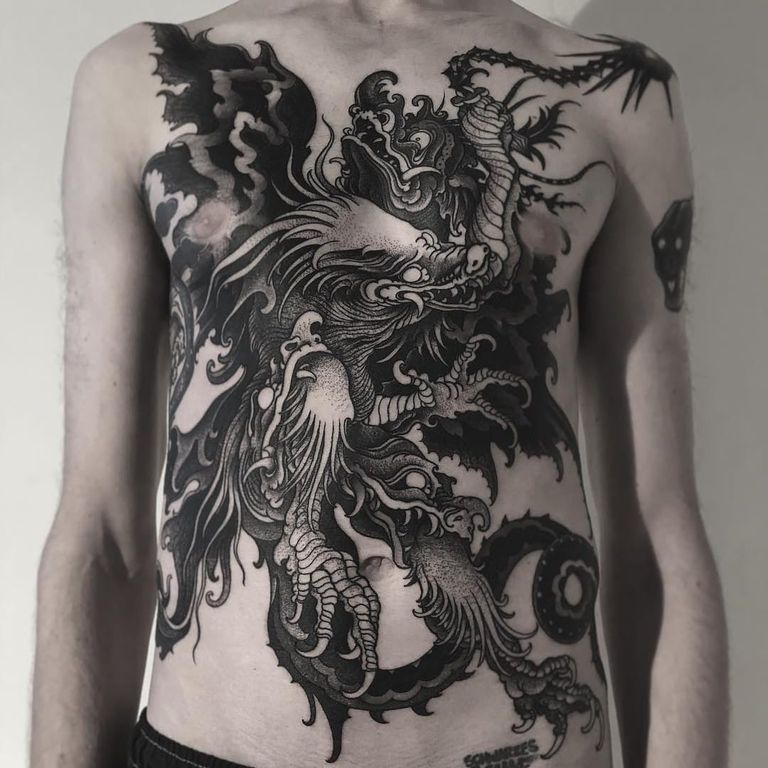
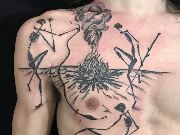
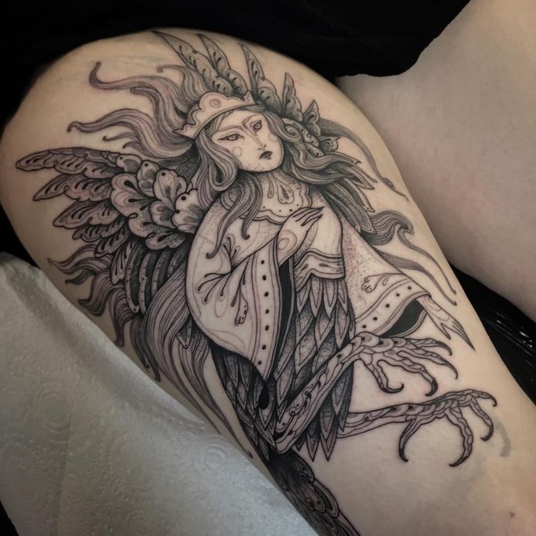
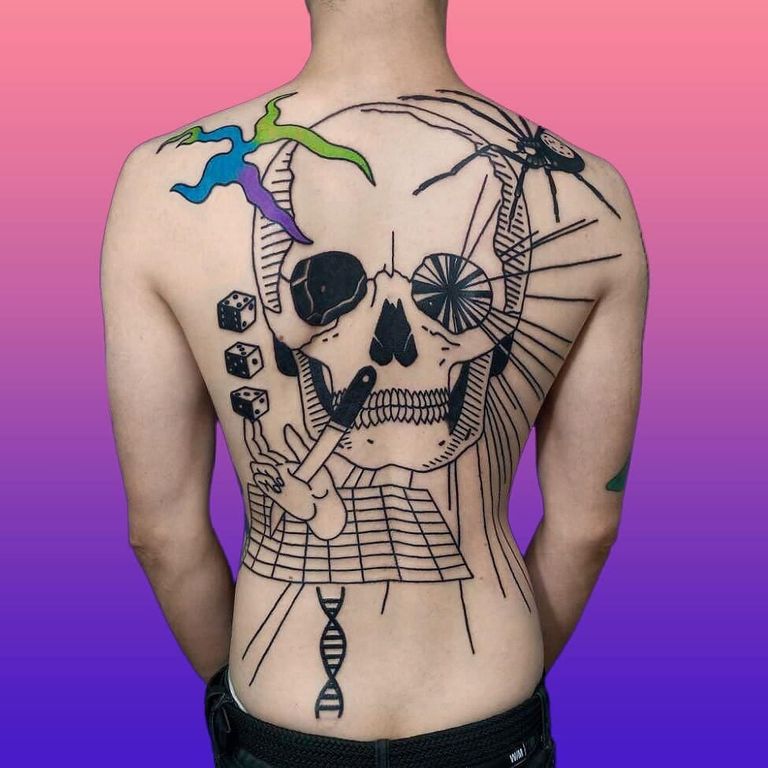
Etching-style tattoos copy old engravings and woodcuts. Every shadow is a field of fine parallel or crossed lines. They’re usually black only. The subjects tend to be dark: skulls, knights, anatomy and mythical beasts.
Sketch
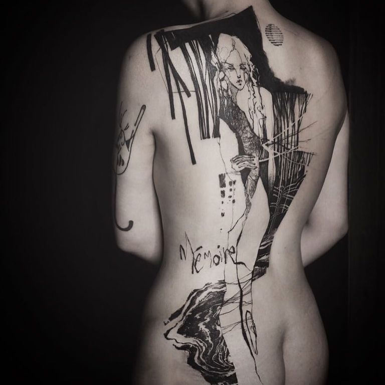
Sketch tattoos look unfinished on purpose. Construction lines stay in, outlines double up, and shading is scribbled. Done well, it reads like a page from a sketchbook. Done badly, it just looks unfinished. This is where an artist’s drawing skill shows most.
Fine linework
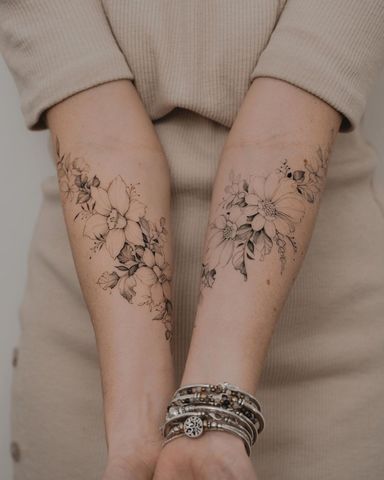
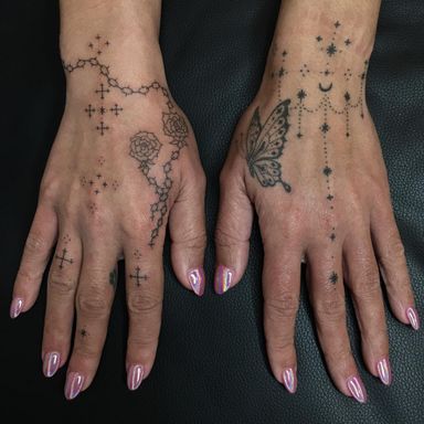
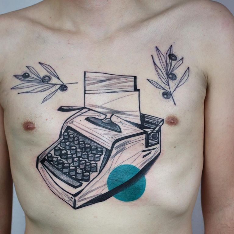
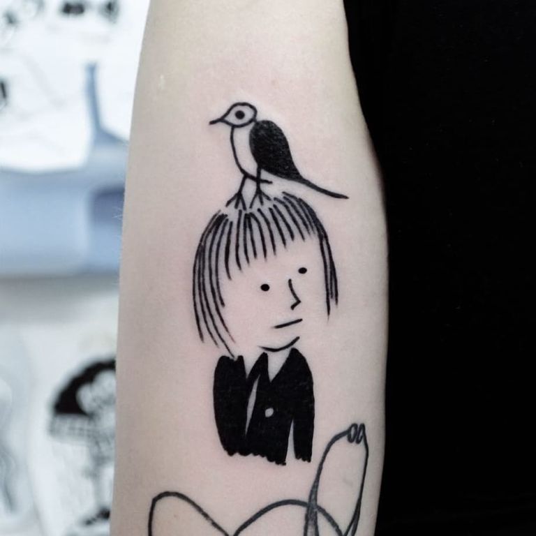
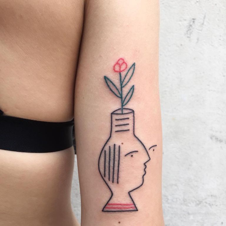
Some artists work almost entirely in thin black line, with little fill. Each piece is still a picture, with a subject, a setting and depth. That’s what sets it apart from a small fine line symbol.
Comic and graphic
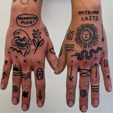
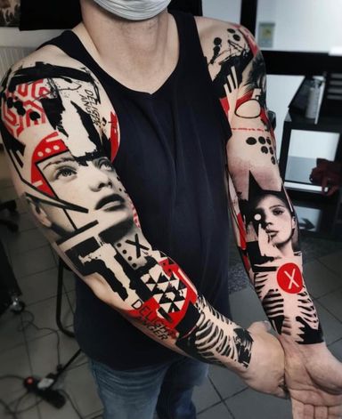
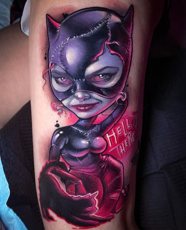
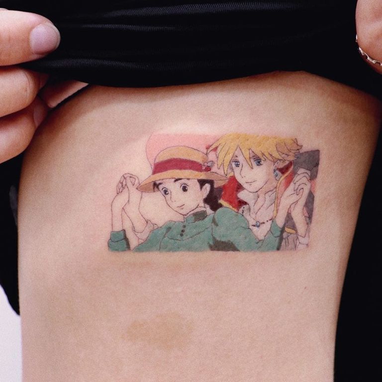
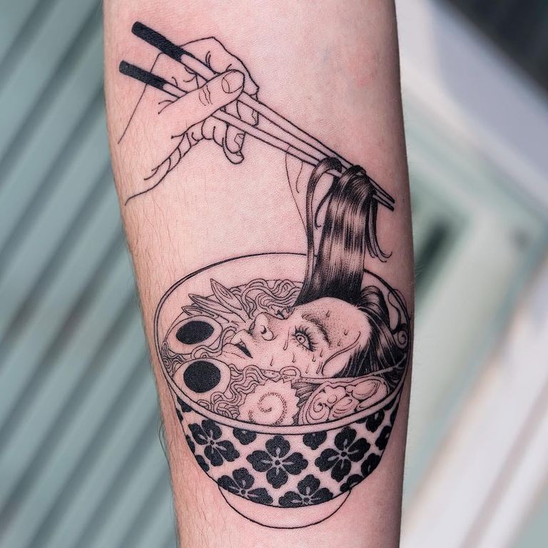
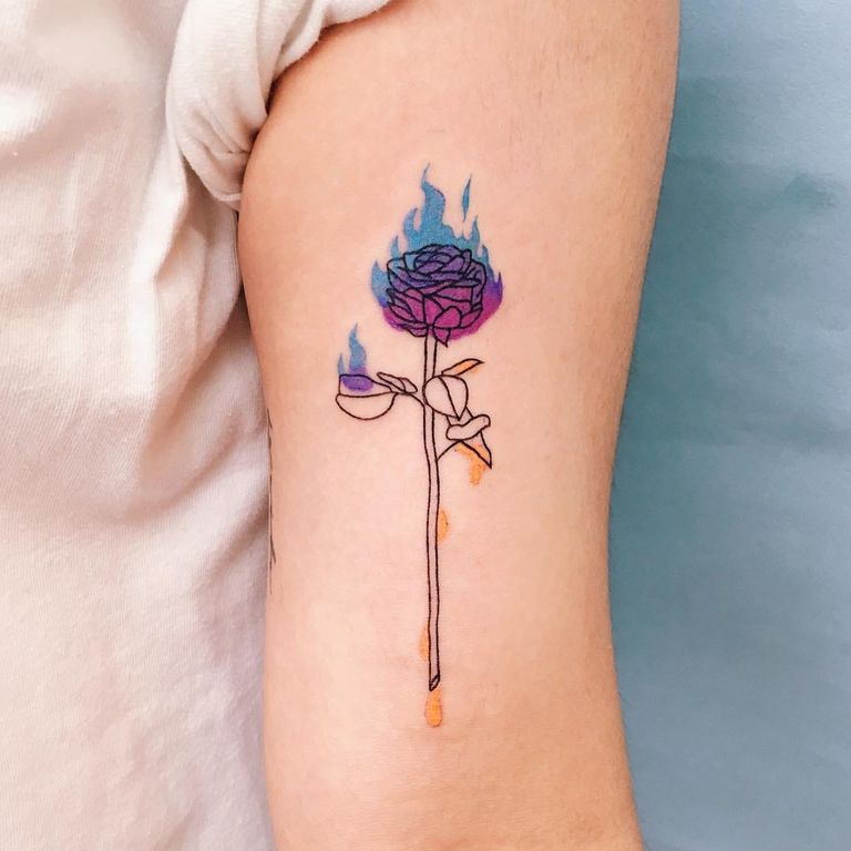
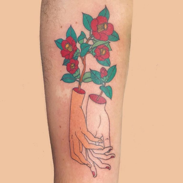
Comic and graphic work uses even outlines, strong shapes and flat color, like a comic panel or a poster. Anime characters and Studio Ghibli scenes turn up often. Color goes down in solid blocks, which keeps the shapes clear.
Painterly
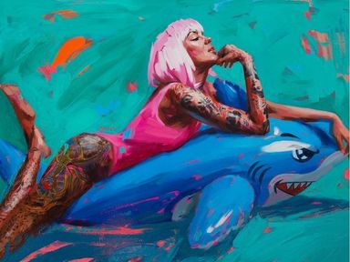
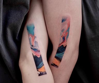
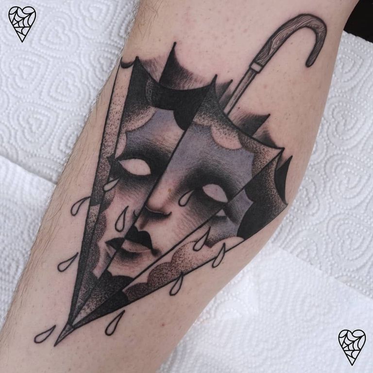
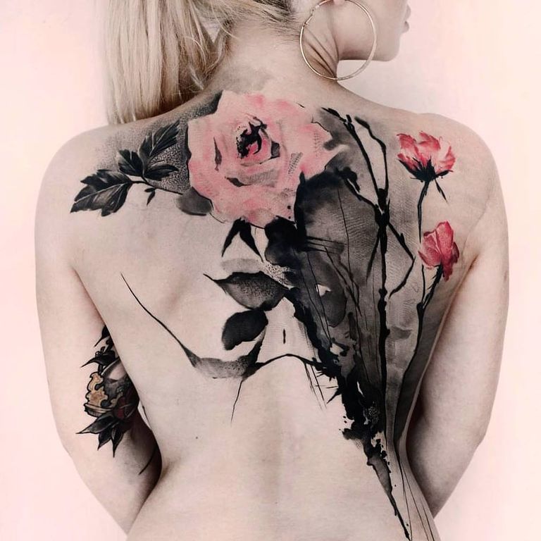
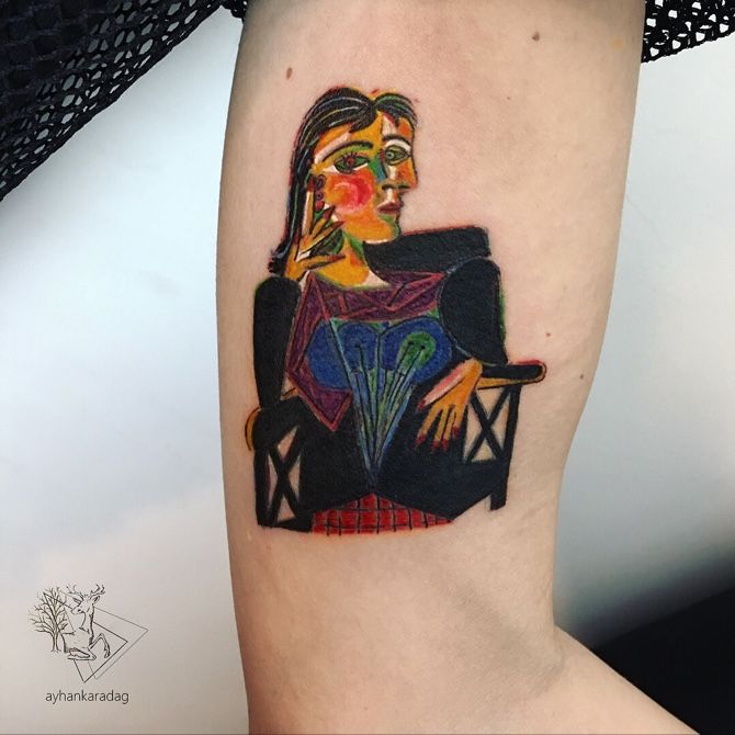
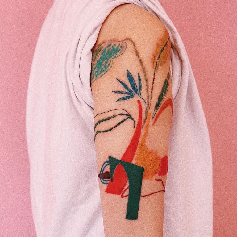
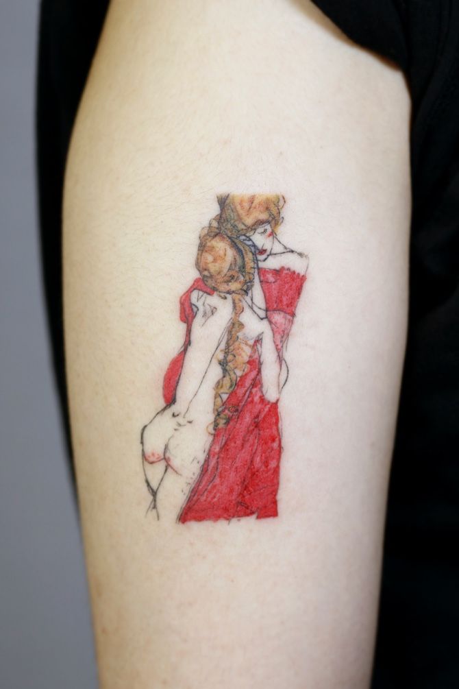
Painterly tattoos borrow from fine art: washes, brush marks and color that spills past the outline. Many quote painters like Picasso or Matisse. Once no drawn edge is left, the tattoo has crossed into watercolor.
Where illustrative tattooing comes from
The label is recent, so there’s no founding artist or date. But you can see its sources in the tattoos.
The first is printmaking. Before photography, pictures were cut into wood or metal, and tone was mostly built from lines. Albrecht Dürer’s engravings, such as Melencolia I, are still the model for etching-style hatching.
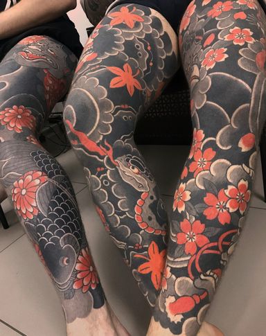
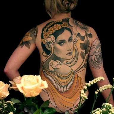
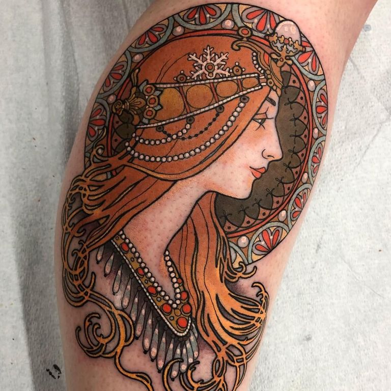
Another is Art Nouveau, best known from Alphonse Mucha’s posters. It took its firm outlines and flat color from Japanese woodblock prints, a craze known as Japonisme. Japanese tattooing drew on the same prints.
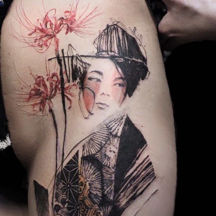
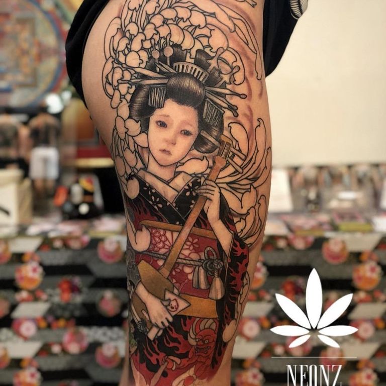
Painterly work leans on modern art, like the nervy line of Egon Schiele and the loud color of Picasso and Matisse. The newest source is comics, manga and animation.
Illustrative vs. neo-traditional, realism and other styles
Many tattoos belong to two styles at once. Blackwork is defined by the ink and illustrative by the drawing, so an etching-style skull is both. Fine line is defined by the needle, and an illustrative piece can be fine or heavy.
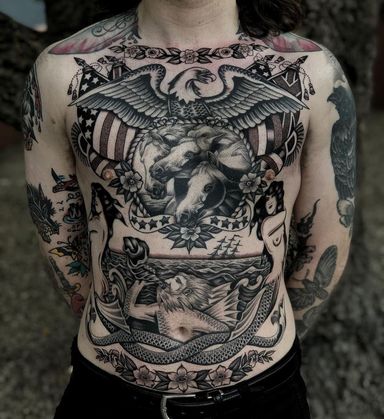
Neo-traditional is the closest relative. It has house rules: heavy outlines, framed designs and rich color. Illustrative doesn’t.
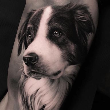
Realism hides the line. Illustrative realism is the hybrid. It has lifelike shape and light, but keeps visible lines or a sketched background. It’s a common request for portraits and animals.
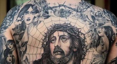
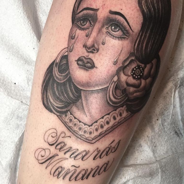
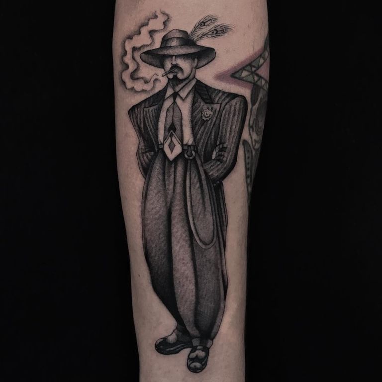
Chicano black and grey looks illustrative, with roots in pencil and ballpoint drawing. It also has its own culture and imagery, so treat it as more than a look.
How illustrative tattoos age
Much illustrative work is built from fine line, so it shows age early. Close hatching slowly merges into a grey patch. Small dot gradients flatten, and hair-wide gaps close up.
The rule is simple: the finer the line and the denser the detail, the bigger the tattoo needs to be. A strong outline holds the shape even as the shading softens. If you love a hairline etching look, give it room. Ask your artist what size it needs to last.
Painterly pieces with no outline lose their edges soonest. A few black lines to anchor them help a lot.
How to choose an illustrative artist
“Illustrative artist” tells you little on its own. Decide which sub-style you want, then find someone whose portfolio is mostly that. An artist known for sketchy color won’t always do good engraving-style hatching.
- Look at healed hatching, ideally a year old or more. Close lines blur first.
- Check that loose lines look chosen. In a sketch piece, the mess should be deliberate.
- Bring references for subject and mood, not a finished design. Most illustrative artists draw custom work.
For more examples, browse sketch tattoo ideas. When you describe your idea in the artist finder, name the sub-style (etching, sketch, comic or painterly). It narrows things down far more than “illustrative” does.